


If V Empanadas’ founder, Veronica, has a super power, it’s making people feel welcome. Born and raised in Ecuador, Veronica left Quito for the hustle and bustle of NYC, eventually settling in Charlotte, North Carolina as a newlywed. There she tapped into her Latin roots, recipes, and warm memories of what it was like growing up with grandmothers who gathered the family together with delectable meals. Veronica’s empanadas were a huge hit at neighborhood gatherings, and before long, V Empanadas was born.
Veronica has since moved north to the Philadelphia suburbs and came to us for a 360º brand experience. She needed a logo refresh, website, stationery, packaging, a conceptual direction for photography and social media, signage, and even the layout of a market stall which is now up and running at the Lancaster Farmer’s Market in Wayne, PA.
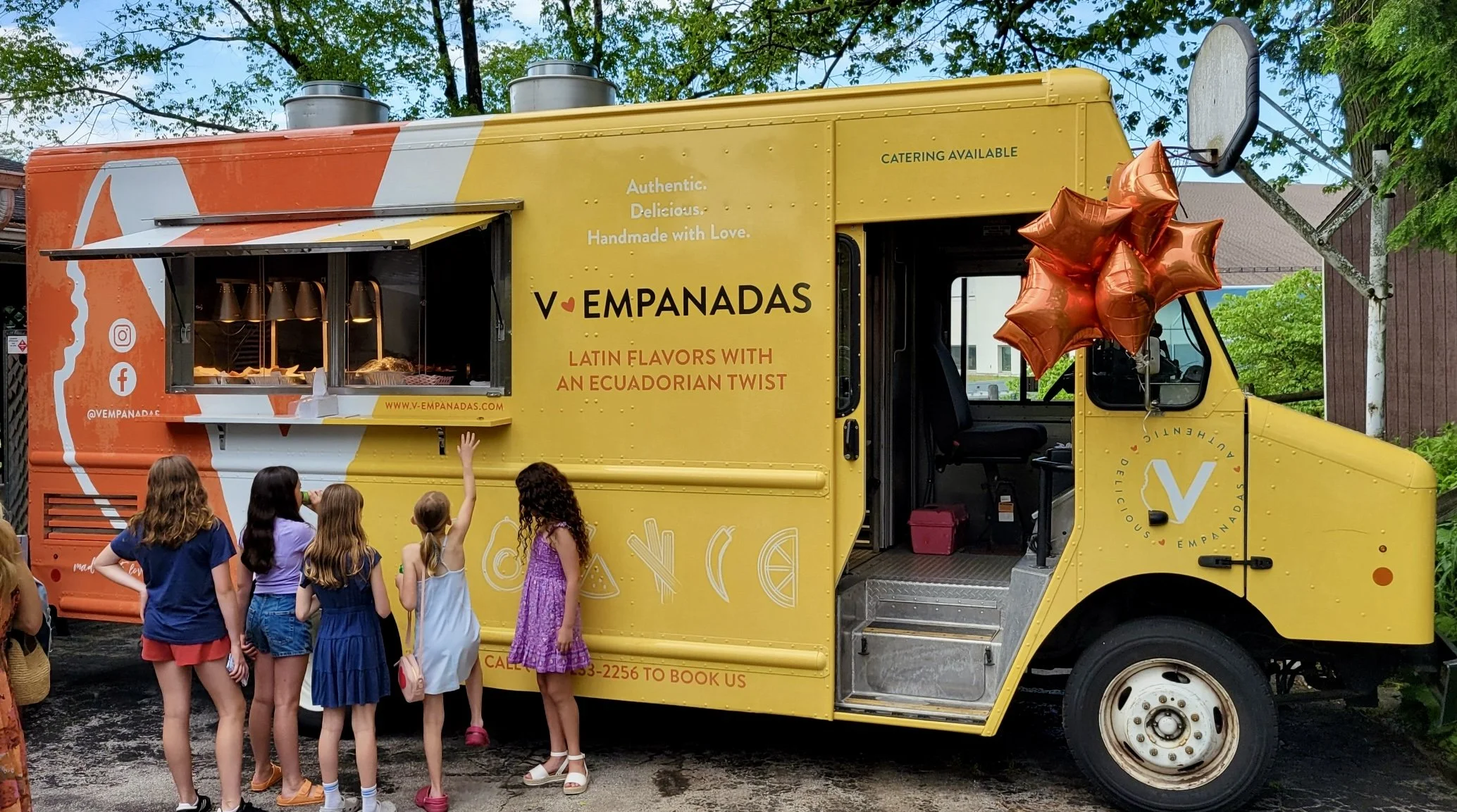
V Empanadas are authentic, delicious, pockets of goodness made with love and that’s exciting what her brand feels like.
When presenting the concept for V Empanadas’ brand identity, we included a series of curated images to convey the creative direction of photography and social media. The images we selected were colorful and bold, and looked delicious, evoking the energy behind our client and her style of cooking.
The V Empanadas brand is about having fun and connecting with others in a lively, meaningful way. The color palette is a huge component of the brand identity and should be a recognizable link across any visuals or photography.
Once the brand’s visual identity was finalized, we got to work on the print collateral — menus, tent cards and point-of-sale promotions.
Even before Veronica signed the lease on her space at the Lancaster Farmer’s Market, we were busy measuring and configuring the space to make it as efficient as possible. Utilizing equipment she already owned and some she was inheriting from the last vendor, we maximized every square inch of her stall.
There was no need for a deep, complicated website so we created a simple landing page for V Empanadas. We’ve since updated the copy and added market and catering menu pages.
We utilized the boldest color of her palette — the Lancaster Farmer’s Market is a busy, open-air space and we wanted people to be able to see V Empanadas’ sign from every corner.