
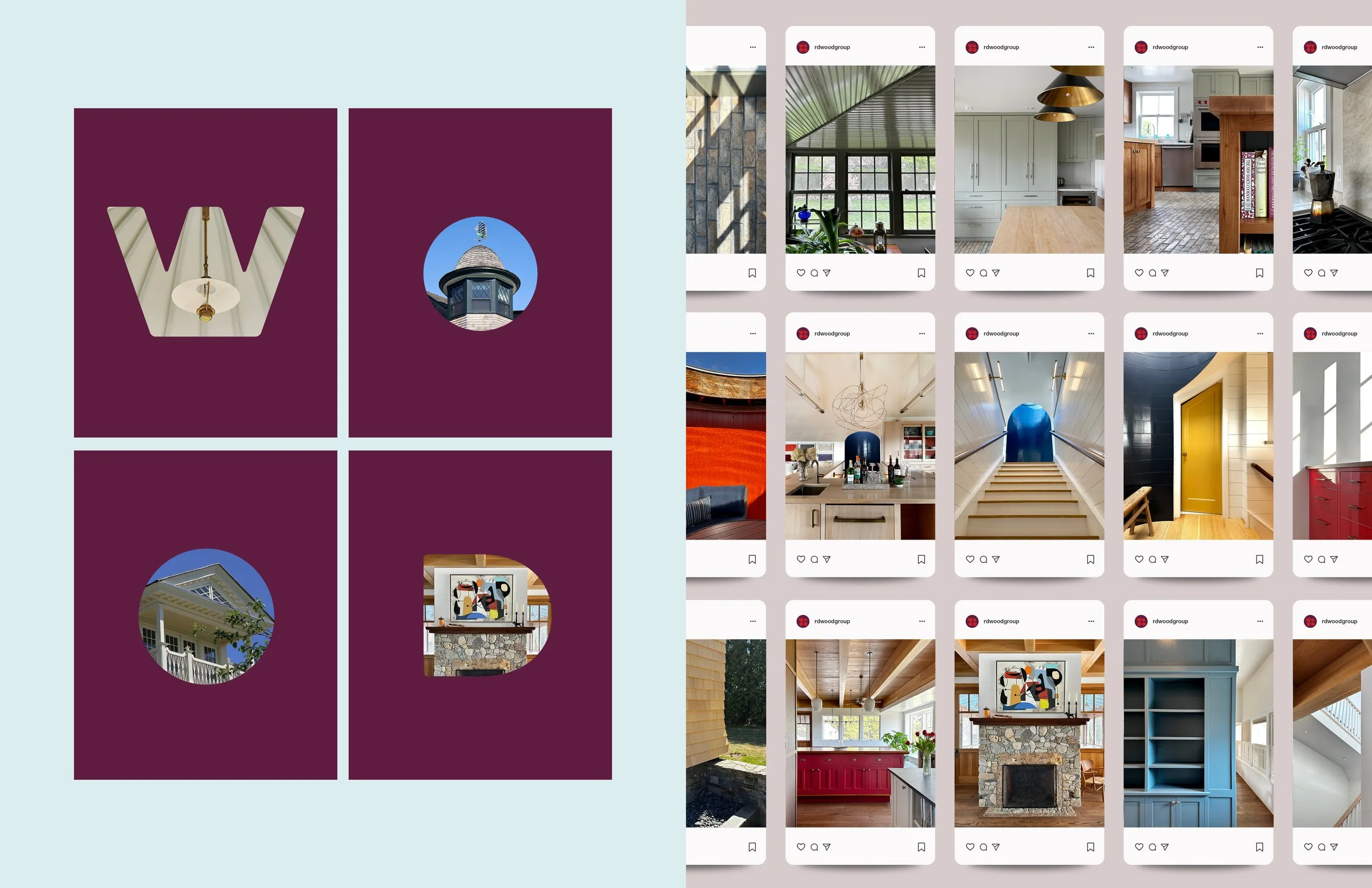


During our discovery process, the R D Wood Group determined its core values to be quality, craftsmanship, integrity and innovation, regardless of scale or scope. With this in mind, their new identity speaks to the art of home design and construction. It’s “peak” artistry; a “window” into the fine art of living well; and the hint of a crown conveys the standard by which they measure their work. It’s a building block too — a team that cares deeply about their work, built on years of experience.
The letterforms provided the perfect opportunity to “peek” at some of their projects and offer a bit of whimsy to the identity. I developed a simple animation that allows for easy updates over time.
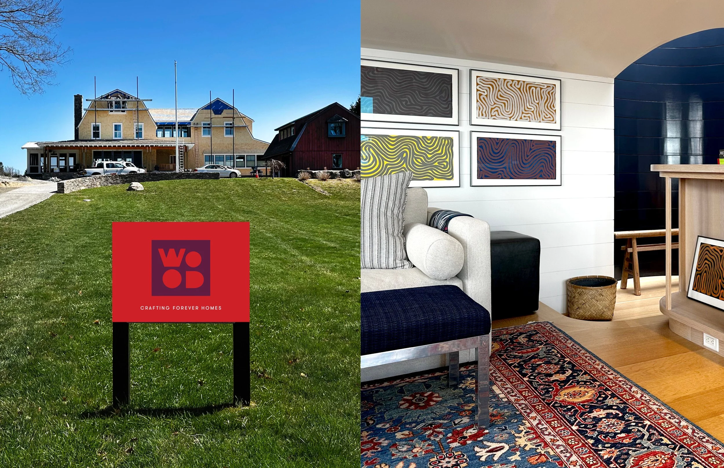
The color palette is a bold and exciting choice — one that clearly differentiates the R D Wood Group from its competitors, who often opt for safe and predictable forms and palettes.
With an image library that hadn’t been updated in years, it was time for new photography — especially since social media was part of the scope of work. Although some photos have been repurposed, ongoing and new projects will be photographed and shared on the R D Wood Group’s website and social platforms.
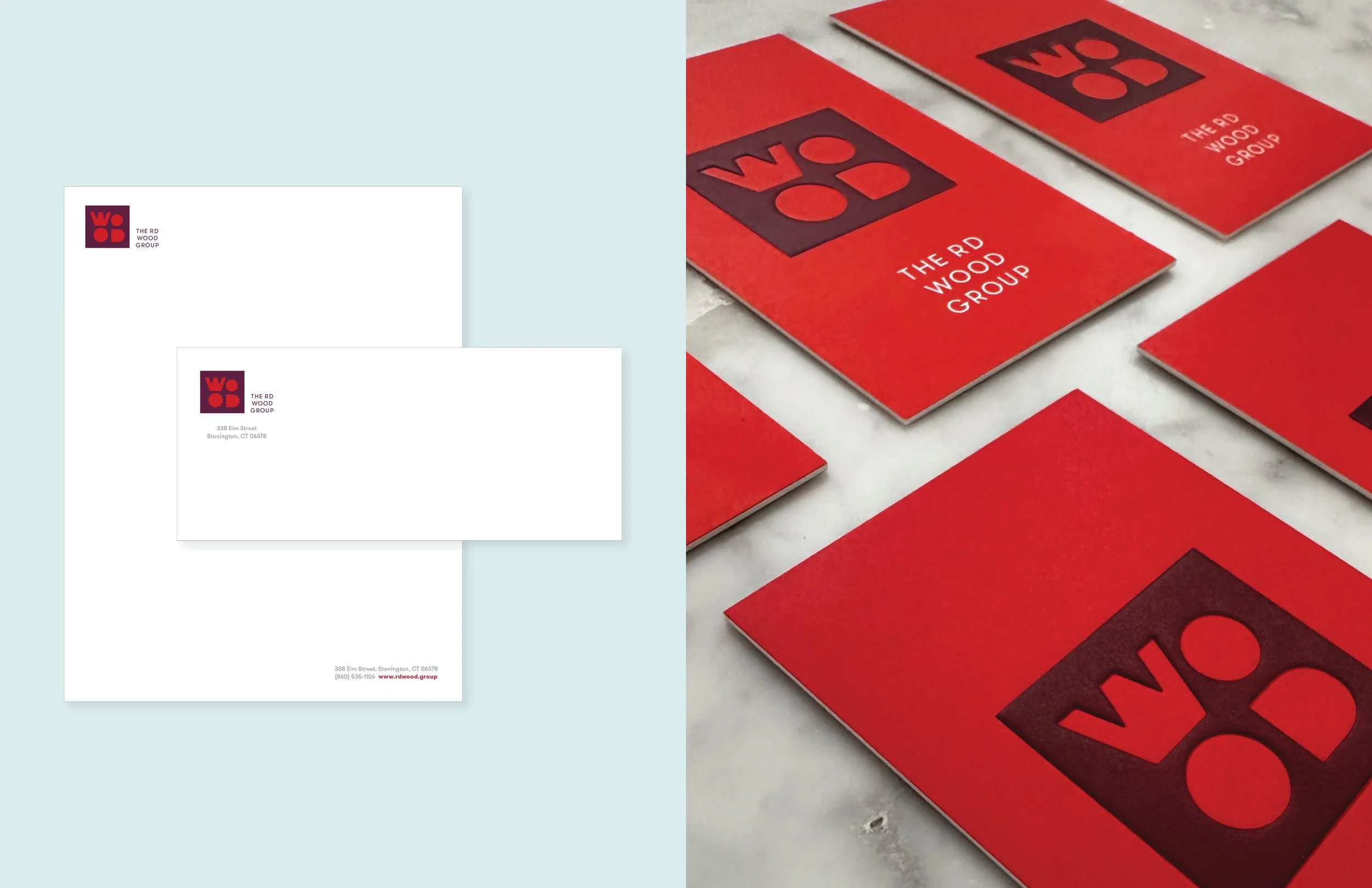
When I presented the identity as a concept, I showed it embossed on leather to help sell the idea. As stationery was in development, there was no doubt that we would do an embossing on the business cards. It is a special detail that helps convey quality and craftsmanship, two core brand values.
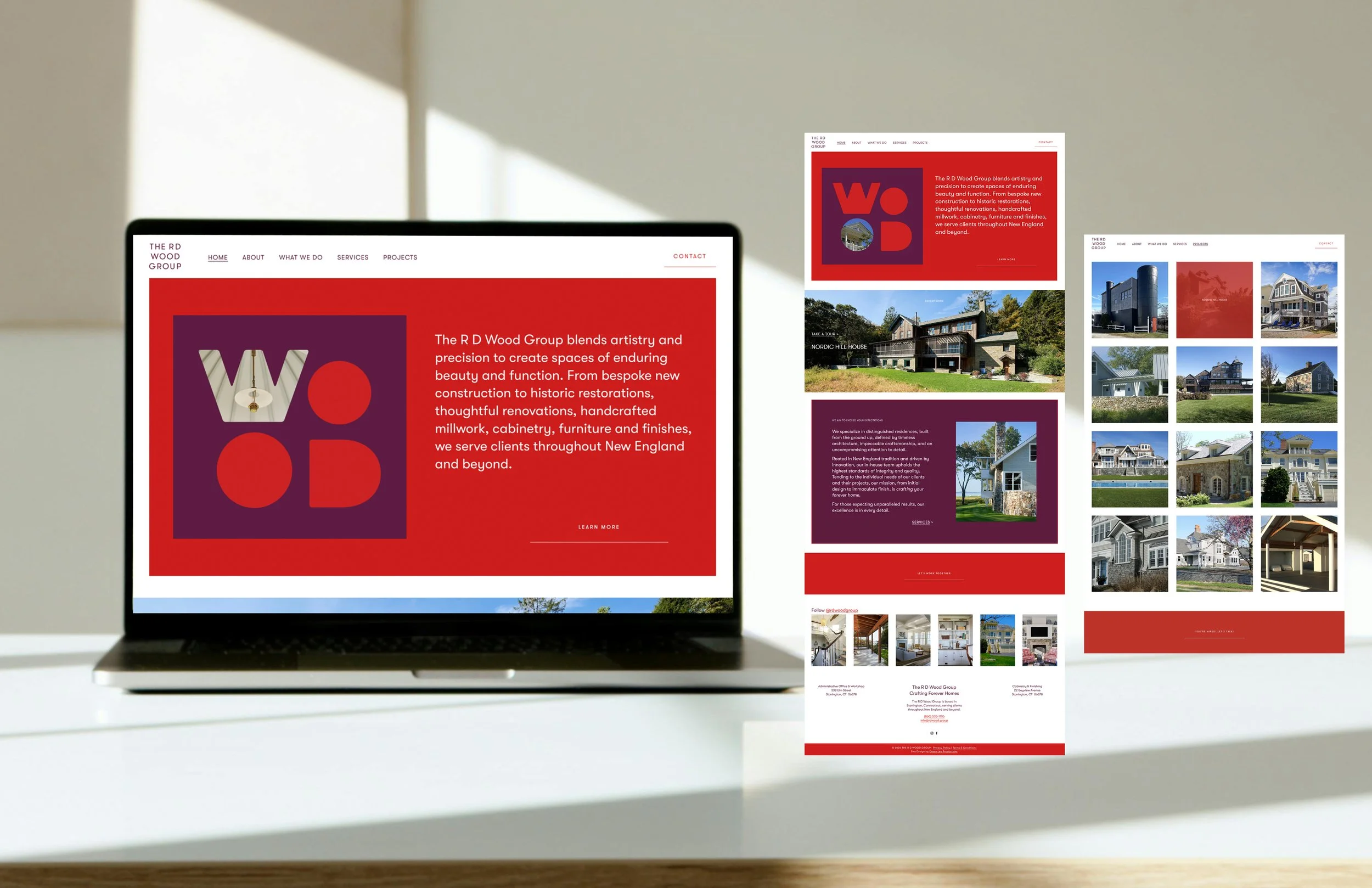
I redesigned, rewrote, and rebuilt the R D Wood Group’s website from the ground up. Every aspect of the site was intentionally designed to be user-friendly, reflect the brand’s ethos, and invite exploration through color and beautiful photography.
Every image was reviewed, renamed, and tagged for SEO.